


FOUNDRY - Responsive UX
Foundry is a community driven app focused on connecting and building entrpreneurs from the ground up.
Problem statement
Samuel is an aspiring entrepreneur who needs access to a transparent and supportive business community because many existing organizations are either misleading and profit-driven or too exclusive and difficult to find.
Goal Statement
“Our platform will let aspiring entrepreneurs follow a personalized, step-by-step learning process, which will affect those seeking to start businesses by removing high costs and complexity while providing inspiration and guidance. We will measure effectiveness by tracking user progress through learning modules, retention rates, and user feedback on confidence and preparedness.”
The User: Samuel

-
Age: 24
Education: Bachelors in Business Analytics
Hometown: Alexandria, Virginia
Family: Single
Occupation: Data Scientist
-
Too many options, hard to filter.
Entrepreneur resources costly/exclusive.
Info scattered across platforms.
Unsure how to turn ideas into steps.
-
Access affordable, reliable resources.
Join inclusive professional communities.
-
Communities push paid programs.
Platforms cluttered and confusing.
Info overload, too many tabs.

the Design
Paper Wireframes
DIGITAL WIREFRAMES
My digital wireframes focused on the user journey from starting an account with Foundry to exploring their first week task list to further their business idea.
For this project I focused on the essential pages for the concept, including the connect page, and the task bage.
My paper wireframes started with a the idea of a simple and straight forward design / layout.
I focused on the user and what tabs would be most important, which led me to the profile and the task list specifically.”

Mockups
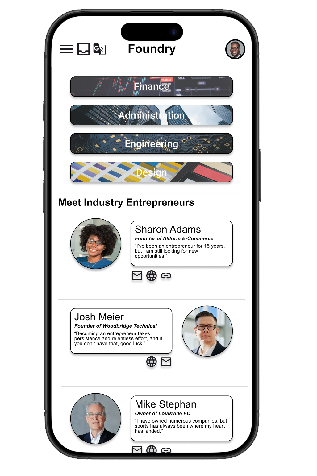


My High-Fidelity designs are focused on a sleek layout combining deep shadows and bold icons and word boxes. The homepage is meant to provide the user with a perfect homepase, providing community entrepreneurs to connect with, as well as narrowing it down by industry.
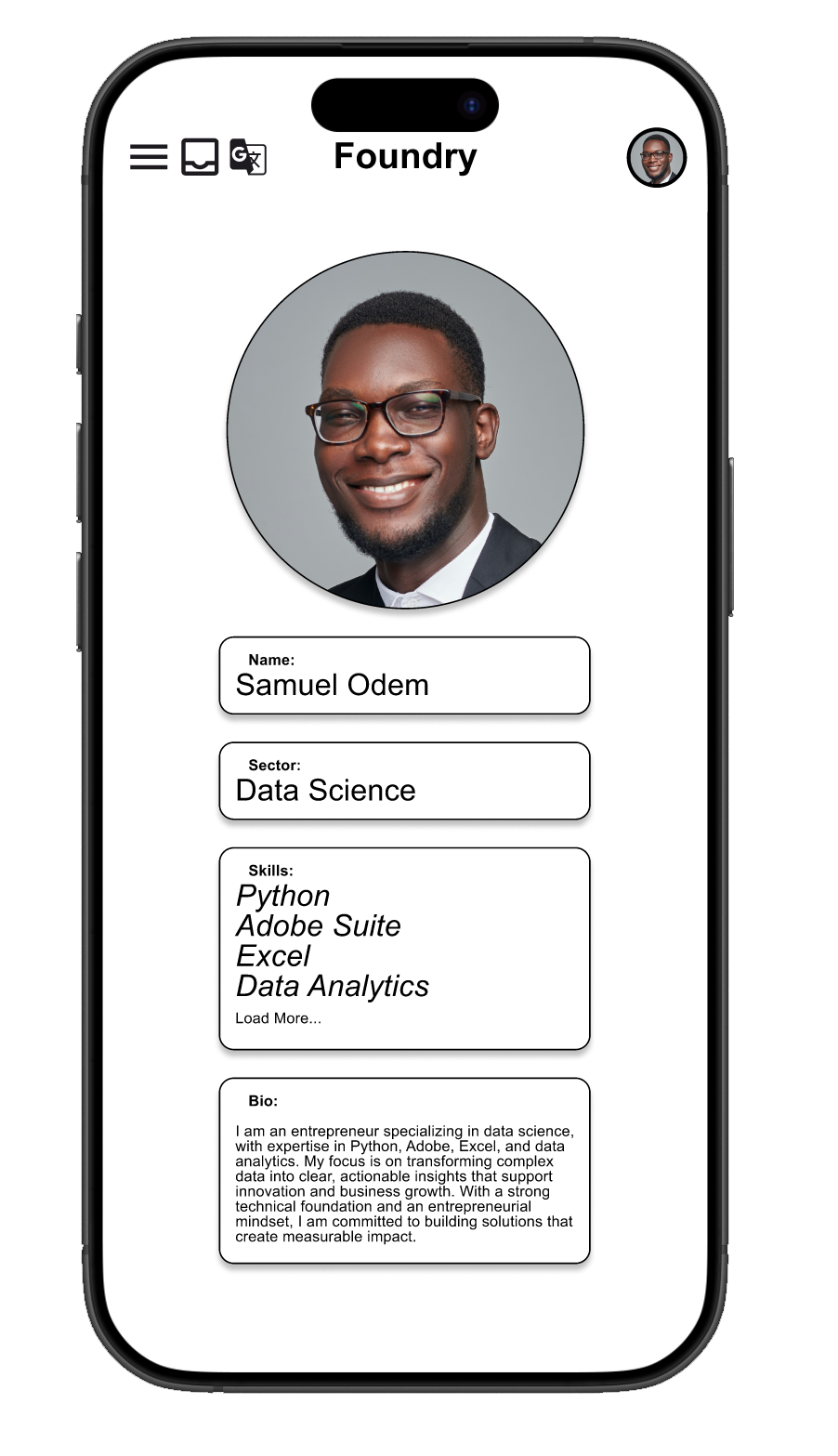
The profile design is meant to be simple and straight to the point including the users background and bio. Through the menu icon the user can access the task map, where they are given weekly objects to solidify and launch their prospective business. The green icon can also be pressed to provide the user a more in-depth view of their weekly tasks.

Takeaways
IMPACT
This project reduces the cost and complexity of starting a business by giving aspiring entrepreneurs a personalized, step-by-step path and an open, supportive community. By vetting resources and showing transparent pricing, it counters misleading, paywall-heavy programs and makes trustworthy guidance easy to find and act on.
What I learned
For this case study in the Google UX design Professional Certificate, I really focused on the most important tabs to design. As a business owner myself I was able to have a little fun with the layout and some of the design elements in Figma.